
When I was in high school, my favorite football team wasn't very good. I was excited when we'd win at least half the games in a season. I also distinctly remember once when the cable company switched to a "more competitive game" during the 2nd quarter because we were losing so badly.
When the Ducks started to get good, though, things changed. We rocketed up the national rankings and became a household name. We shot as high as a #2 national ranking in 2007, and everyone was proud to be a Duck fan.
Then we stayed good. We even got better. We played for a national title and two Rose Bowl championships. This year, we're ranked #2 once again and, hopefully, looking at another shot at the national title.
But with success and notoriety comes hate. I can no longer watch a game and actually listen to the commentators, not because they're cheering for and supporting the other team, but because they're cheering against my team.
No one talks about how well the Ducks are doing anymore. Now they talk about how awesome it would be for the Cardinal or Spartans to knock us down. Where we were once the celebrated underdog, we're now the despised status quo. It's frustrating.
And I'll bet Comic Sans feels the same way.
Flash back to several years ago when Oregon Trail was the most popular video game on the market, cell phones were the size of lunch boxes, and the Internet was consumed over a screechy telephone connection. The most widely used font was Times New Roman, and if someone managed to use something else (like Arial) they were instantly the cool kid in class.[ref]What? Using a particular font doesn't make you the cool kid in class? Darn.[/ref]
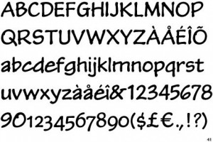 In 1994, a new font came on the scene - Comic Sans. It was fun, lacked the rigid, straight lines of the "professional" Times and Arial fonts, and definitely challenged the status quo. Programs started adopting it as their default font face (Microsoft Comic Chat[ref]Yes, I actually used this font ... don't judge me ...[/ref] used it quite extensively). Students tried to get away with using it on research reports. Websites started using it to accent headlines.
Comic Sans was new. It was different. It felt young, informal, and fresh.
For a while, if you said you wanted to use Comic Sans for something, no one would question it. But flash back to today, and both designers and developers are ridiculed for their choice of font if comic sans makes an appearance.
Why?
The best list of reasons I've found comes from a list of Twitter responses to the question "Why do you dislike Comic Sans?":
Font isn’t bad in its own right but since it’s over used by kids and students, it looks stupid when applied to professional design
it’s because anyone can use it, so it looks so unprofessional. It’s a web font now for goodness sake!
Comic Sans: too available, overused; most often used by individuals with no design skills.
Many people dislike Comic Sans not because it's a bad font, but because of its ubiquity.
I recently had a client ask specifically to use Comic Sans for her site design. She was running for public office and wanted to brand herself as fun and edgy - so the font was a fairly good fit for what she wanted to do. As a somewhat standard web font, it was also immediately available for just about all of her constituents' mobile devices and computers.
About halfway through the campaign, I got a call.
"Hey, can you switch the fonts on the website to something else? I still want fun, young, and cartoony ... but my friend's a designer and complained that Comic Sa ... Saint ... Sans, yeah, is unprofessional and that I shouldn't be using it."
So we swapped out the font on a couple of pages, but the overall tone of her campaign was gone. Remember, this was after sending out hundreds of postcards, campaign brochures, contribution envelopes, and posting signs all through the county. The majority of people we spoke to in person loved the youthfulness of her branding, and a few actually pointed to the pages we changed on the website as now looking unfinished because of all of the straight-lined Arial font.
Should she have used Comic Sans in her campaign? Absolutely. It fit exactly the message she was trying to campaign and worked (technologically) for the audience she was trying to reach.
Should you use Comic Sans? That depends on what you're trying to convey and to whom.
Should designers roll their eyes and curse the name of Comic Sans every time they hear it? Absolutely not. There is nothing wrong with using Comic Sans.